Produced in Kent asked us to publish a magazine for TOKA, their renowned annual celebration of the vibrant food and drink industry in Kent. They wanted to showcase the achievements of each finalist in a tangible, leisurely format distributed to a public audience.
Project Overview
ᗐ
PRODUCED IN KENT — TOKA // Publishing / Layout Design / Product Photography / Proof Reading
ABOUT
Produced in Kent is an organisation dedicated to championing the production of food, drink and craft focused products. Supporting hundreds of businesses through their own membership scheme.
Their renowned live event The Taste of Kent Awards (TOKA) is an annual celebration of the businesses that innovate and work to create some of the best food and drink produce in the UK.
The awards are open to all businesses in the food, drink and related hospitality sectors, but not exclusively to their Produced in Kent Members.

PUBLISHING
Produced in Kent had to diversify their live version of TOKA temporarily due to ongoing covid-restrictions and turned to a live-streamed event.
To accompany this they asked us to design and create a new annual publication that would support the new digital direction of the awards.
The goal was to provide the attendees and the wider public audience an insight to what each of the finalists have achieved while also extending the visibility of the awards all year round.

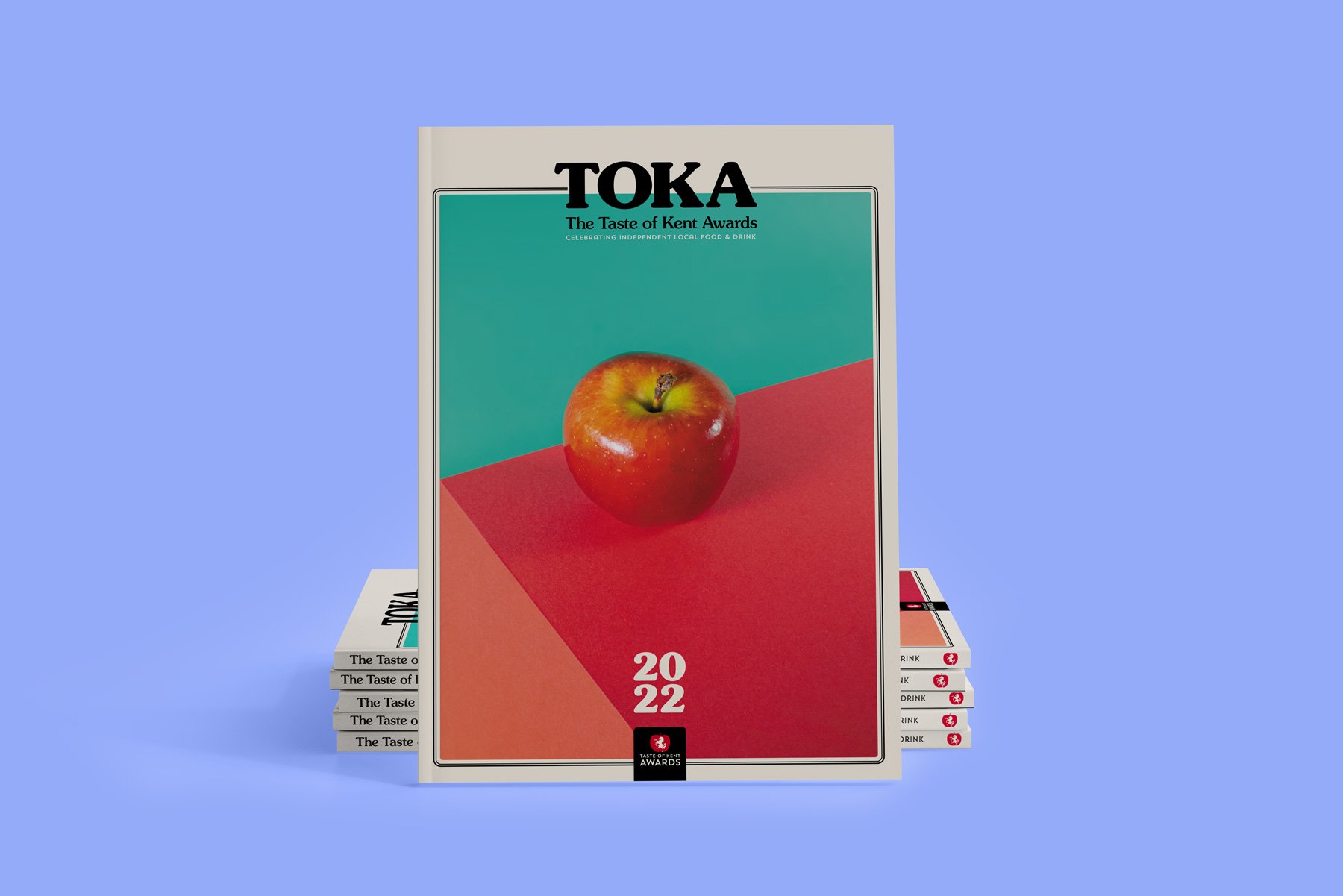
COVER PHOTOGRAPHY
For the first edition of TOKA (2021), we were asked to create the cover shot with as many individual types of Kent produce we could comfortably present to give a ‘banquet’ feel.
We took this onboard and approached this with a 70s cookbook treatment with a tongue-in-cheek nod towards your nan's pantry.
With the continuation of the second edition, we decided to simplify the cover showcasing just a single apple to represent the new brand direction of TOKA.
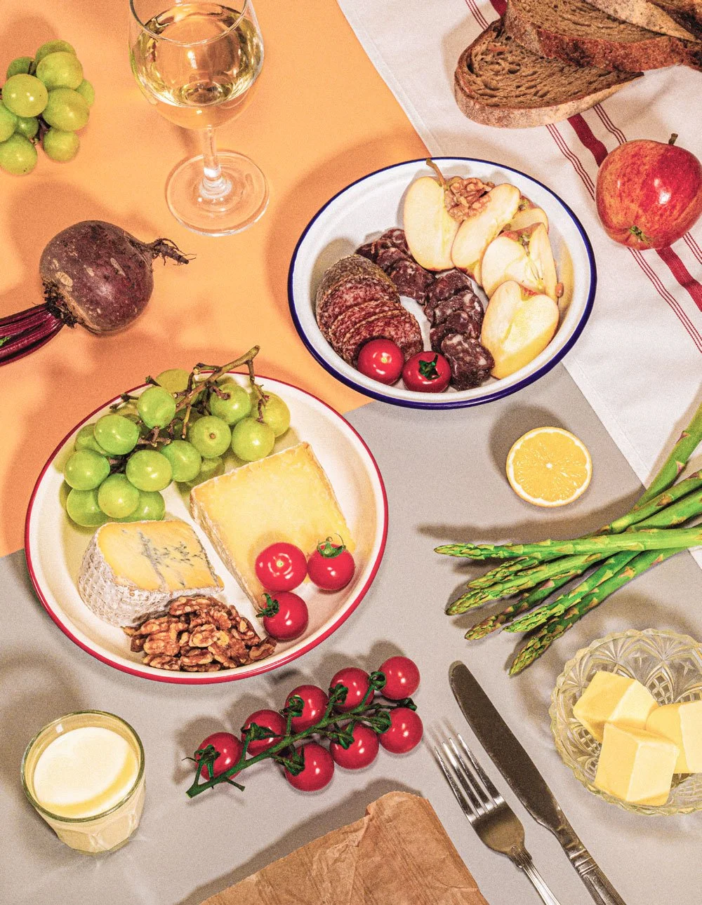


LAYOUTS
TOKA is an A4, magazine-style publication with a mixture of recipes, finalist profiles and information on sustainability commitments.
Both editions were created with a retro cookbook feel, using classic fonts and details, with a modernised fresh approach.
This encouraged the publication to be picked up by a wide audience including younger readers for the on-trend retro revival design and nostalgic and relatable to an older age group.


